

Showing posts with label Prismacolor. Show all posts
Showing posts with label Prismacolor. Show all posts
Thursday, April 5, 2012
The Diva, the Icon, and the Rebel in Copics
These are the floating faces I used for trying out my Prismacolor markers. I decided to see how they would look with Copics. I like them much better this way...


Monday, January 30, 2012
The virdict
In the previous two posts I took a measure of what I could achieve with the colors in my Prismacolor markers palette. I have had these markers in my cabinet for a while, but I never dared to use them on a full scale before, because I had too little experience with them and I was afraid of ruining my drawings. I knew the earth and grey tones work very well to establish backgrounds and to create a base that keeps brighter colors from becoming overwhelming, in other words, to give unity to the drawing.
However I had to plan ahead, for my own peace of mind, before making more ambitious attempts.
My impression at the end of this experiment is that Prismacolors are most definitely not equivalent to Copic markers. The colors that I would have instinctively picked for skin gave at first very scary results. Both Pale Peach and Eggshell (not to mention Light Peach) are way to orange-y and bright for my taste. In general all neutral combinations resulted too dark for my tastes. I usually like to start really light (with Copic R000, to give you an example), build progressively the skin-tones and shade/shadows, and have full control on how deep or intense they become. Here, after laying down the first "lighter"color I found myself regretting the choice and looking anxiously for a way of smoothing things down.
Maybe I should have made bigger use of the colorless blender. I could have started laying color at the borders of the face and then I could have diluted the excessive brightness by blending it away toward the center of the face. I did not think to do this, because with Copics the blender is something I mostly ignore and pick up only to correct accidental smudges here and there. With Copics I always blend with other colors.
With Prismacolors blending is much more difficult and the effect is always to intensify whatever color you began with. I am sure part of the issue has to do with my choice of paper. I used Fabriano Artistico Watercolor paper, which usually works marvels with Copics. Looks like Prismacolors soak the paper too quickly and also that they dry much quicker than Copic, leaving a very tiny window for attempting to blend. I would like to see how they behave with Strathmore Bristol paper, which I have used in the past with alternate fortune.
Bottom line, while using this Fabriano Artistico (of which I have purchased several pads) I will happily used Prismacolors in some special occasions and like before for big areas (they go down really evenly and this is a great plus), but for delicate details like faces I will rely mainly on Copics.
What were your experiences comparing Copics and Prismacolors?
Sunday, January 29, 2012
Skin Tones in Prismacolor Part 2: Cold hues
...And this is the second set of floating faces, with more strange and unearthly colorings. I like some of these very much. Others came out a bit too over the top for my taste, but there might be occasion when these combinations could work.


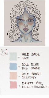


 Which ones are your favorites among these ones?
Mine are C1, C2, and D2. :)


Mine are C1, C2, and D2. :)
Skin tones in Prismacolor Part 1: Neutrals


Mine are A3 and B1. :)
Next, the 6 combination of cool colors.
Thursday, November 10, 2011
The new banner is up!
Hello again! So, "At the stroke of 5" is finally ready and, with my husband's kind contribution, it now welcomes visitors at the top of the blog page. So glad this time things worked out properly. ;)
Here is the drawing without the writings on it. As always, I used Copic markers with some Prismacolor markers for the background and I worked on precious Fabriano Artistico watercolor paper, which has a lovely texture and helps a lot with color blending.
What do you think?
Here is the drawing without the writings on it. As always, I used Copic markers with some Prismacolor markers for the background and I worked on precious Fabriano Artistico watercolor paper, which has a lovely texture and helps a lot with color blending.
 | |||||||||||
| At the stroke of 5, the young Duke invited his fiance to have tea at his family's residence. Needless to say, his parents were surprised. |
Sunday, August 21, 2011
Tea with the mermaid-finished
It's done. Sorry, I was too lazy to make a WIP progression on this one...
Ok, I don't think this will fit, unless somehow I change the size of my banner here (or, to be precise, I ask my husband to try and do it for me) or I cut mercilessly the picture. Oh well, I think I'll have to make another attempt, paying more attention to the spatial contrains...
Meanwhile enjoy the freshness of tea under the sea with this kind and hospitable lady.

Ok, I don't think this will fit, unless somehow I change the size of my banner here (or, to be precise, I ask my husband to try and do it for me) or I cut mercilessly the picture. Oh well, I think I'll have to make another attempt, paying more attention to the spatial contrains...
Meanwhile enjoy the freshness of tea under the sea with this kind and hospitable lady.

Friday, May 6, 2011
The secret of the forest
Hello again! After many days (I should say evening) of work and despite the busy period at work, the first panel of the theater project is finally done. Here is the WIP and the completed drawing. Enjoy!


I should add that the fox and crow are a homage to Pit's great grandma and her famous rendition of the ages old tale of "Le corbeau et le renard". When my husband and his sister, Pit's mom, were children, she used to tell the story to put them to sleep. Things did not really go as she expected. She would start the tale in french "Maître Corbeau, sur un arbre perché, Tenait en son bec un fromage..." and then she would promptly fall asleep with great merryment of her audience. It's a sweet family memory that we all want to share with little Pit...and here is my contribution. ^^
Thursday, April 14, 2011
In Arwen's shoes completed.
I finished my Lord of the Rings-inspired piece, "In Arwen's shoes". This is the progression from inking to the final piece (if you want you can also see the initial drawing in pencil from a previous post):

 |
| Inking: the easy part |
 |
| Defining a palette |
 |
| Sticking to the palette: the hard part for me... |

The finished piece: copic markers with touch ups in pencils and white gel pen. Enjoy!
Subscribe to:
Posts (Atom)